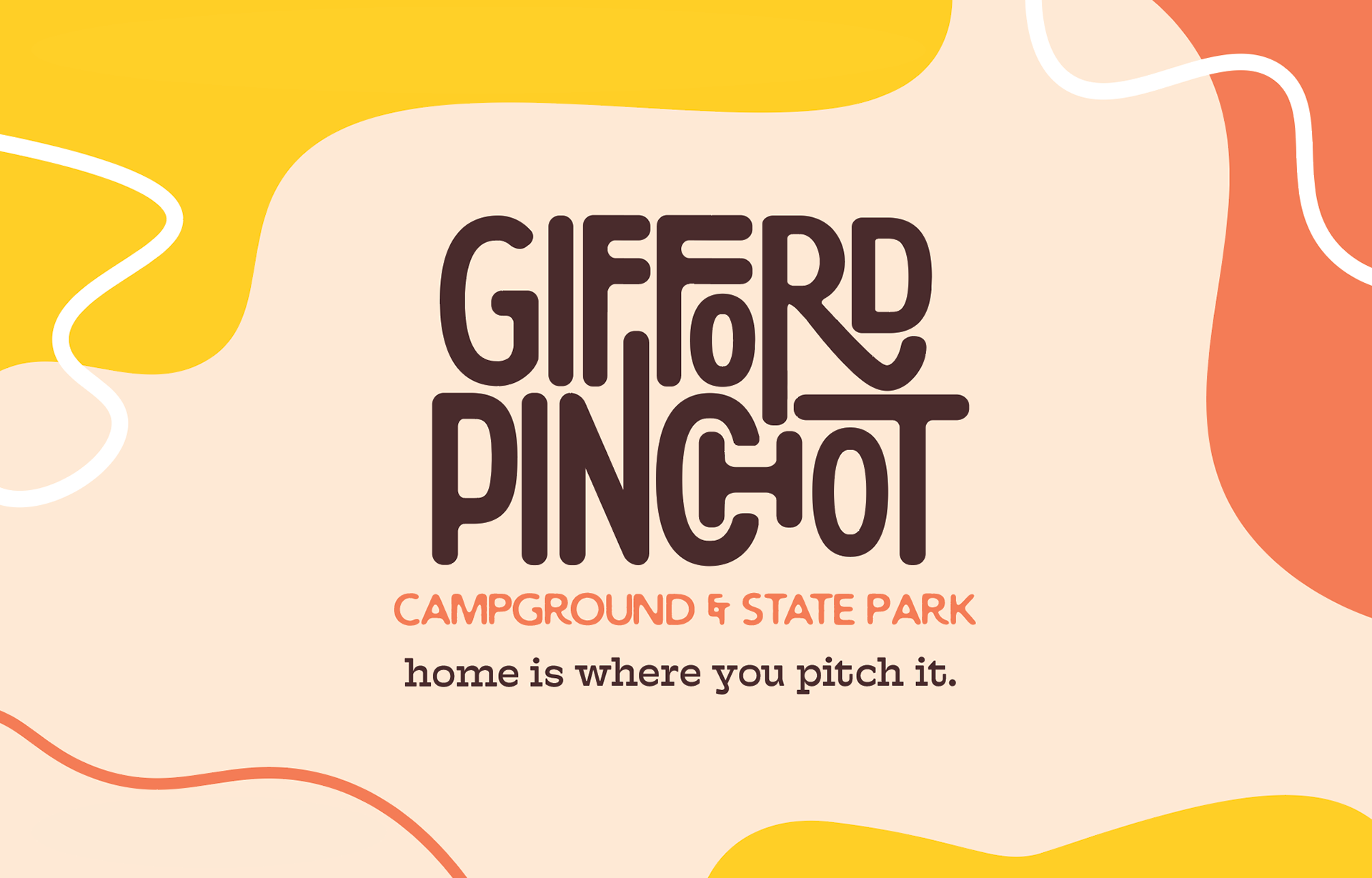
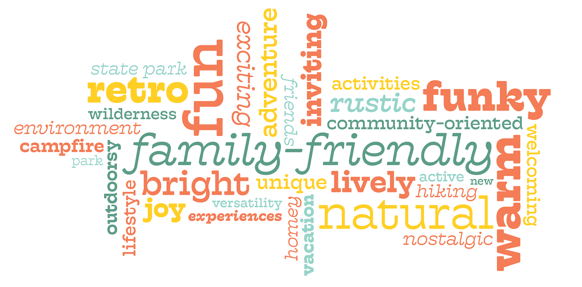
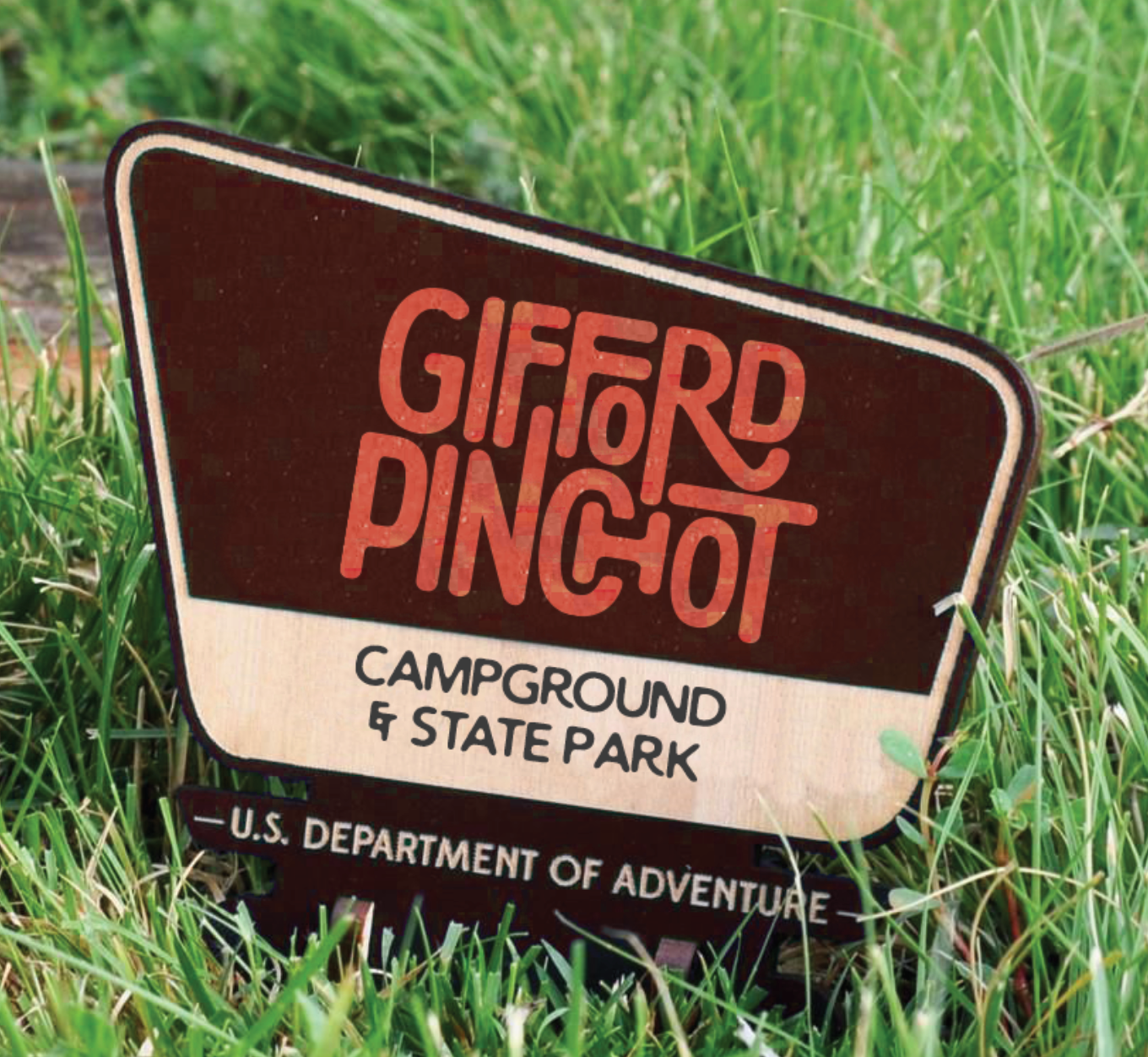
Gifford Pinchot Campground & State Park has been a Pennsylvania staple for nature lovers since 1961. Taking a step away from the overall Pennsylvania State Park branding, and individualizing its approach, I really wanted to focus on having the brand represent its warm, family-friendly environment that feels welcoming to all.
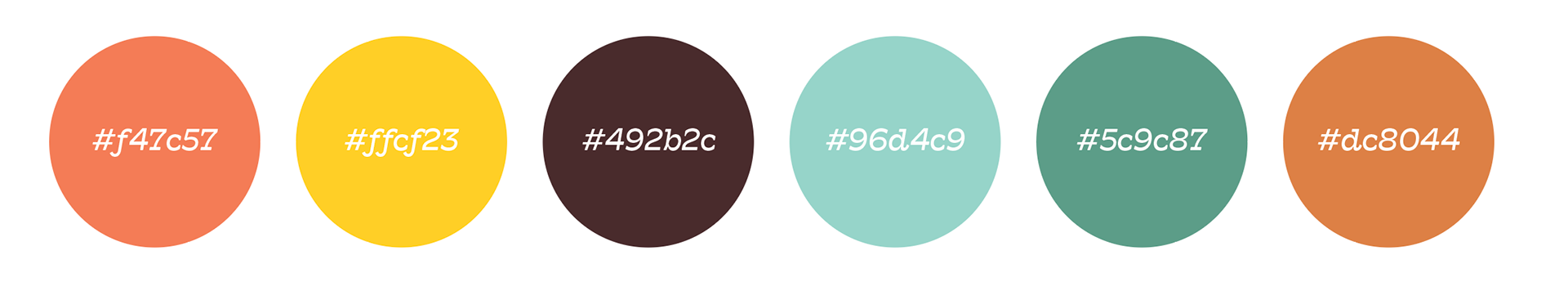
Using a retro, 60s-inspired color palette, funky shapes, and expressive typography, this rebrand gives Gifford Pinchot the ability to truly shine in the endless amount of fun the campground and state park has to offer.
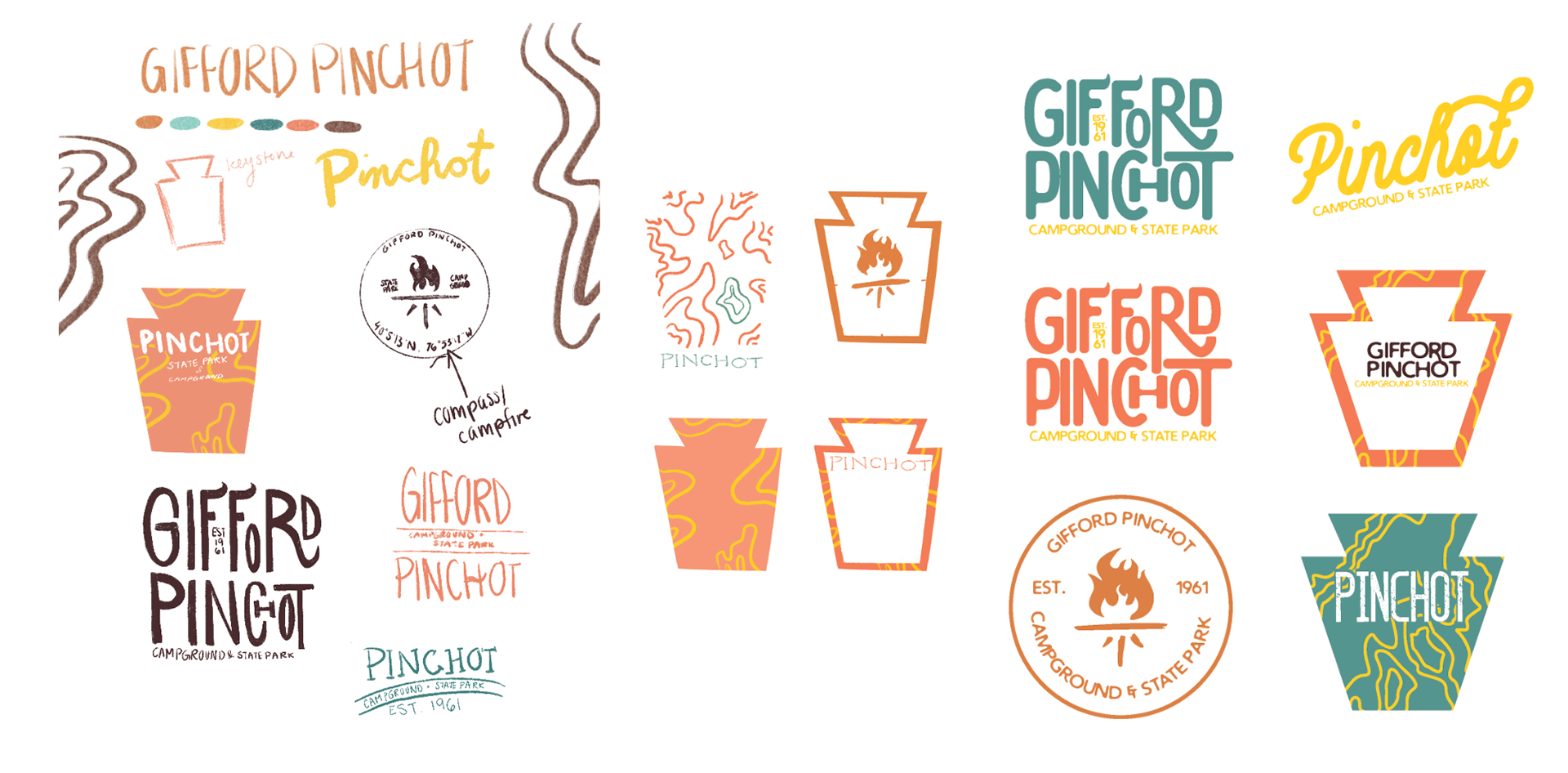
Classic campground motifs, like topographic maps, campfires, and compasses are redefined and used in a modern way. A nostalgic nod to the things that started it all.
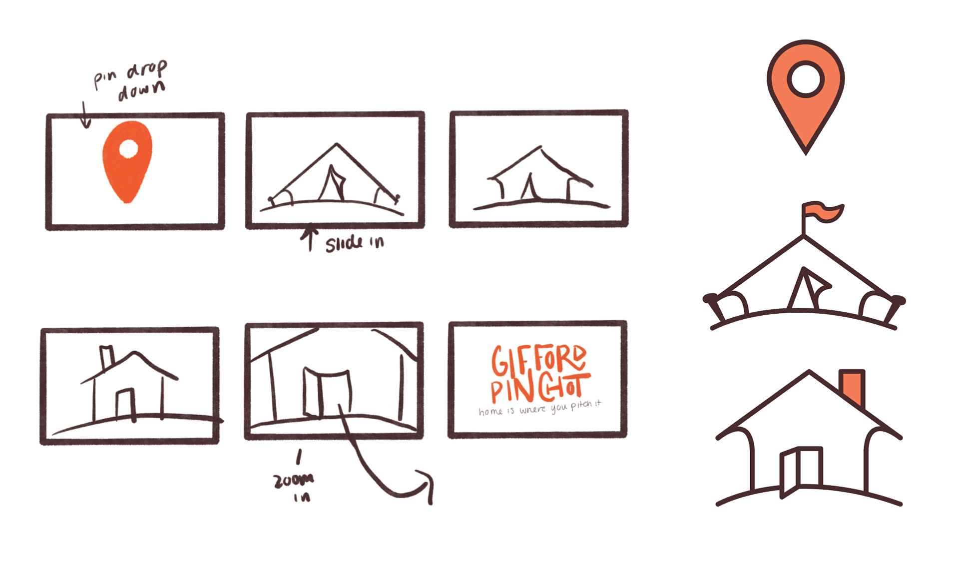
early sketch process
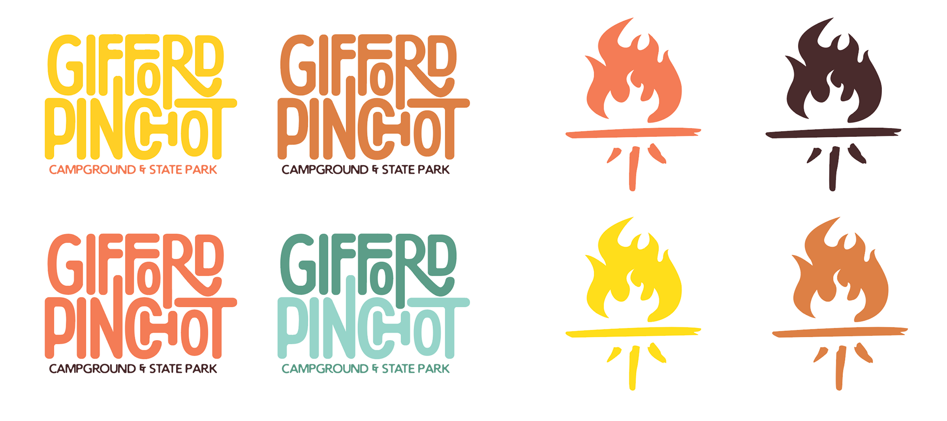
logo color variations
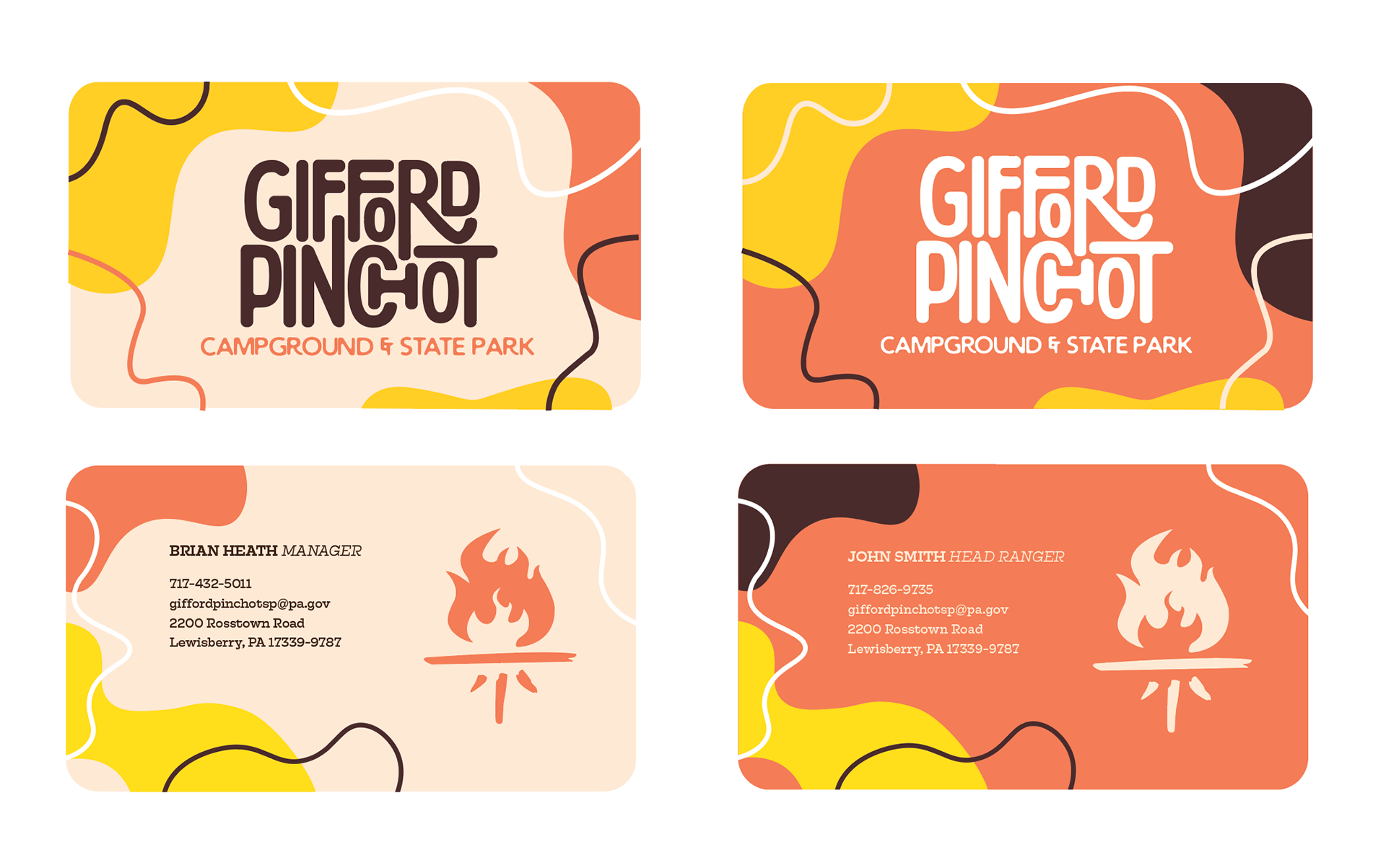
business card design
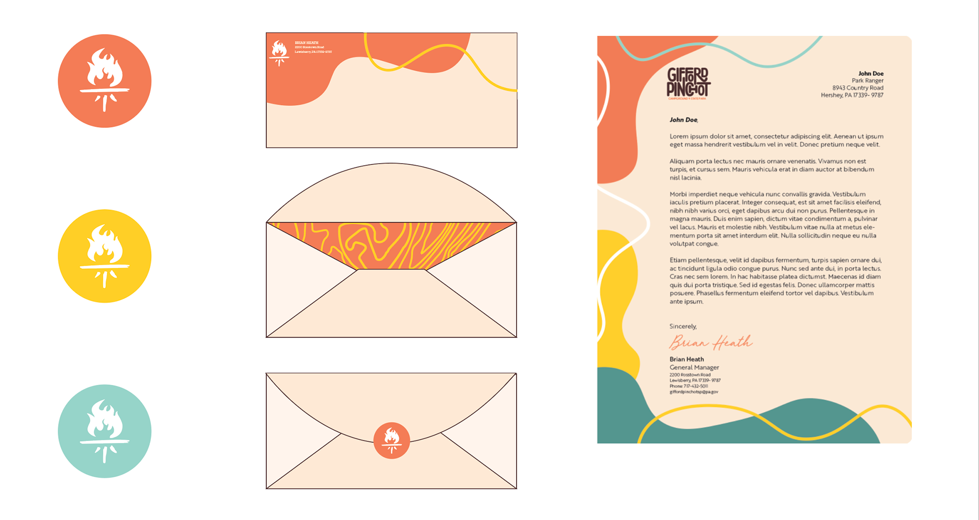
stationery
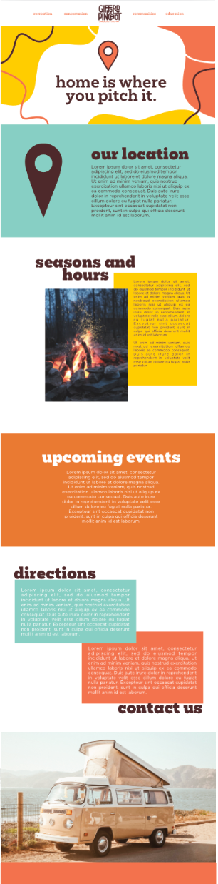
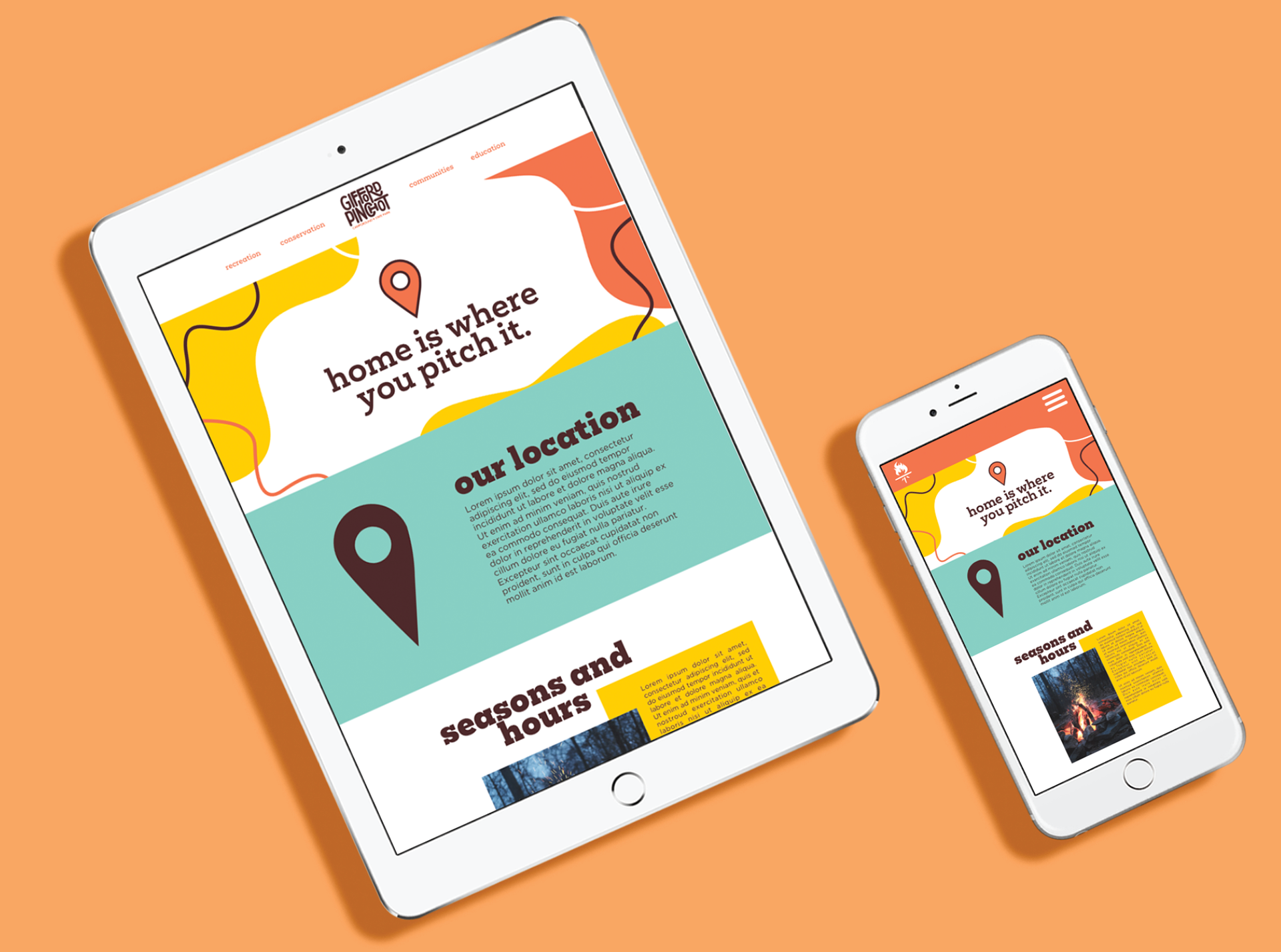
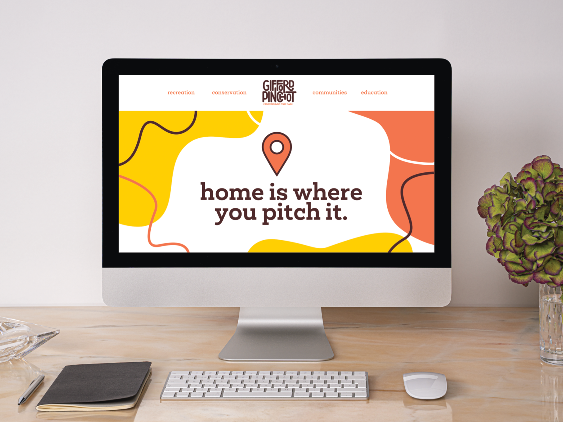
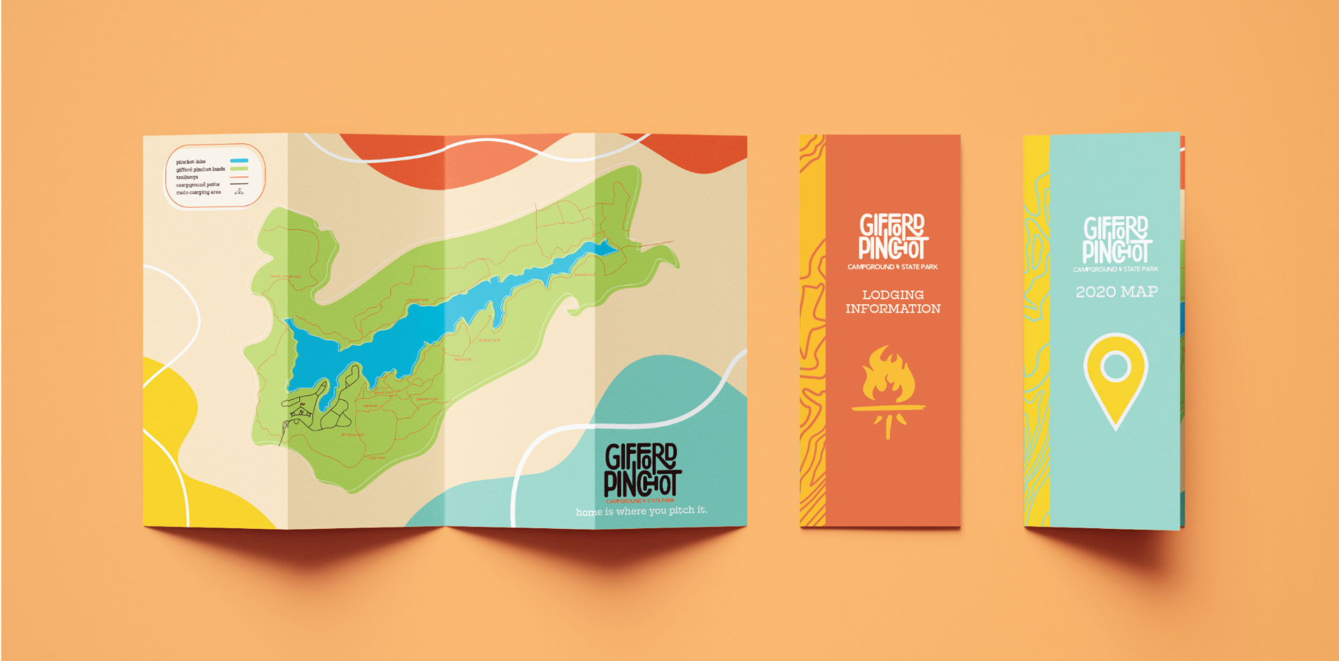
website redesign
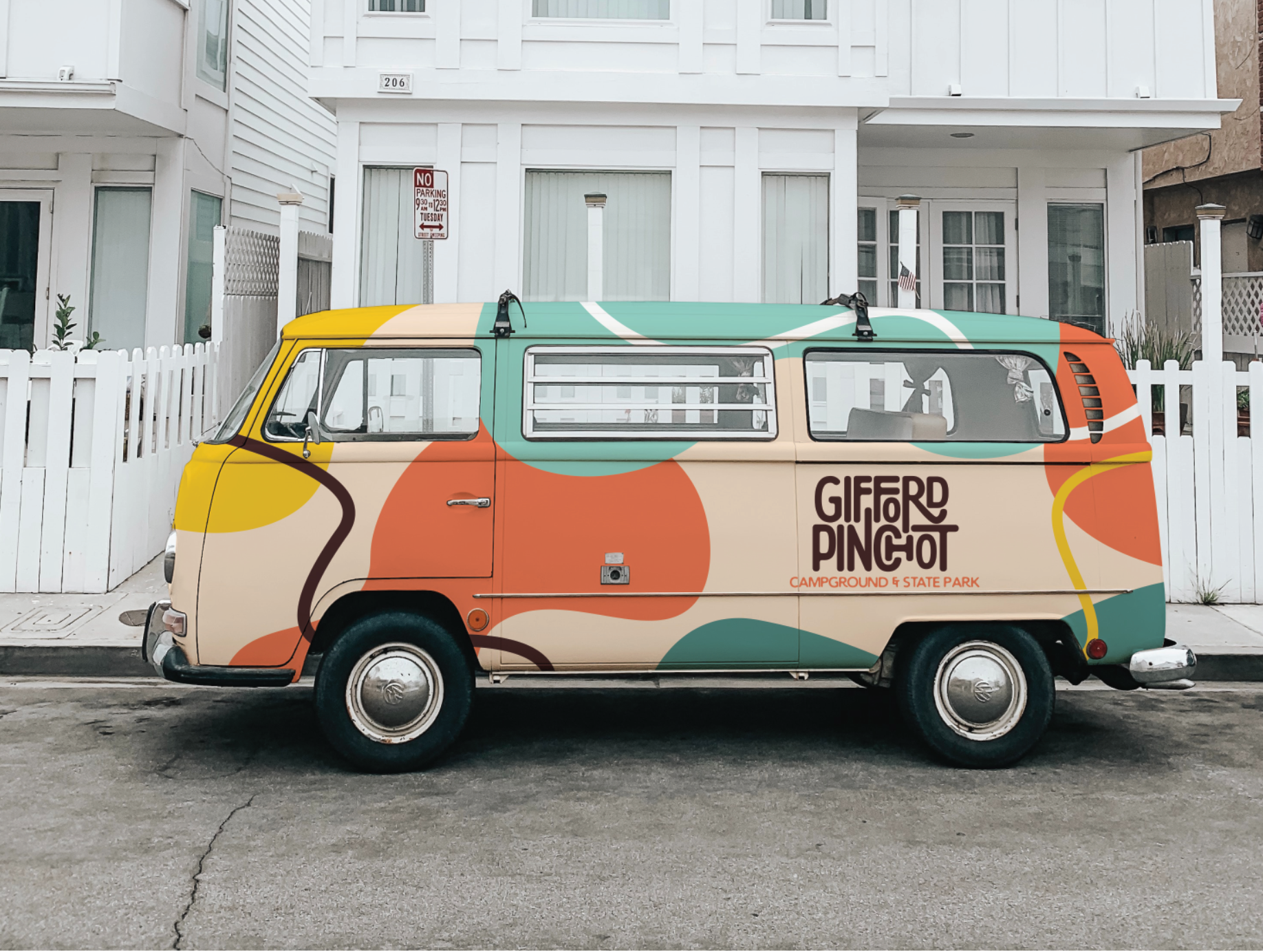
vehicle design
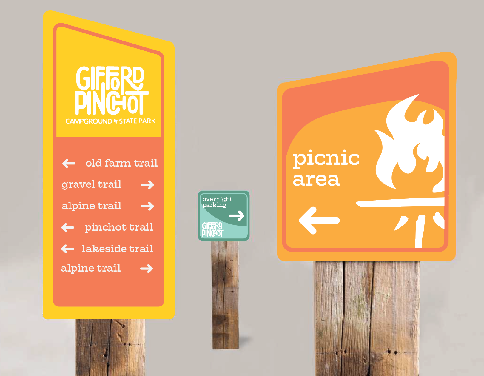
signage & wayfinding
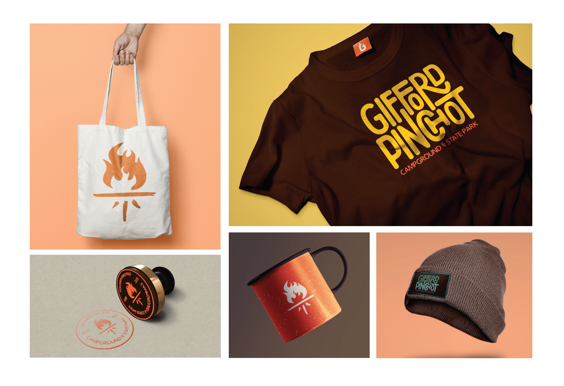
merchandise
animation storyboard
animation